
Chart Types and Timeframes
Every piece of technical analysis starts with a chart, and every chart makes two choices before a single pattern gets drawn: what type of chart, and what timeframe. Getting these basics right isn’t exciting, but getting them wrong quietly undermines everything built on top.
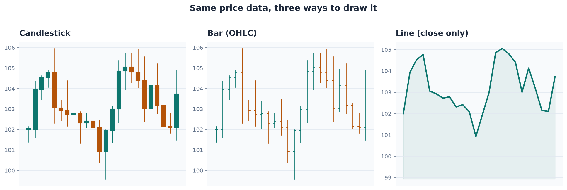
Chart Types
The overwhelming majority of active traders use candlestick charts — a charting style developed in 18th-century Japan, originally for tracking rice prices, that packs four data points — the price when that period started (open), the highest and lowest prices reached (high, low), and the price when it ended (close) — into a single visual shape per time period. Bar charts show the same four data points with small tick marks instead of a colored body, and are functionally equivalent but less visually intuitive. Line charts connect only the closing prices, discarding the intraperiod range entirely — useful for a quick glance at long-term trend, nearly useless for anything requiring precision, since the information about how a period’s trading actually unfolded is simply gone. A handful of variants (area charts, Heikin-Ashi smoothing) exist and have niche followings, but for actionable technical analysis, candlesticks are the standard for good reason: they show the most information with the least ambiguity.
Reading Direction
Charts are read right to left: the most recent price action sits on the right edge, and everything to the left is history that provides context for what’s happening now. This matters because old support and resistance levels lose relevance the further price moves away from them — a level a stock touched eight months ago, in a completely different trading range, isn’t carrying the same weight as a level it tested yesterday.
Timeframes
A chart’s timeframe determines how much real time each candle represents. A 1-minute chart’s candles open and close every 60 seconds; a 5-minute chart’s every 300 seconds; a daily chart’s candle spans a full trading session. Day traders mostly live in three timeframes: the daily chart for overall context and major support/resistance, the 5-minute chart for the cleanest intraday setups (a “setup” is simply a chart configuration that looks like it could lead to a profitable trade), and the 1-minute chart for precise entry timing. Some traders add 15-minute or hourly charts for swing-style context; very few professional day traders use anything coarser than that intraday, because the setups simply aren’t there on odd, uncommon timeframes like 17-minute or 27-minute charts — not because the math is different, but because no one else is watching those levels, which strips them of the self-fulfilling quality that makes technical levels work in the first place.
Multi-Timeframe Alignment
No single timeframe should be read in isolation. A pattern that looks compelling on a 1-minute chart can look entirely different zoomed out to 5-minute or daily — a stock can appear to be breaking out intensely on a 1-minute chart while actually sitting inside a messy, directionless 5-minute range. The practice of checking that a setup holds up across at least two timeframes is often called multi-timeframe alignment, and it’s one of the simplest, highest-value habits in technical analysis: it catches a meaningful share of false signals before they cost money.