
What Makes a Strong or Weak Daily Chart
Every concept covered so far in this course — chart types, candlesticks, support and resistance, gaps, patterns, indicators — comes together on the daily chart. Before looking at any intraday setup, experienced traders size up the daily chart first, because a weak daily chart caps the upside of even the cleanest intraday setup, and a strong one can turn a mediocre intraday setup into a meaningful move.
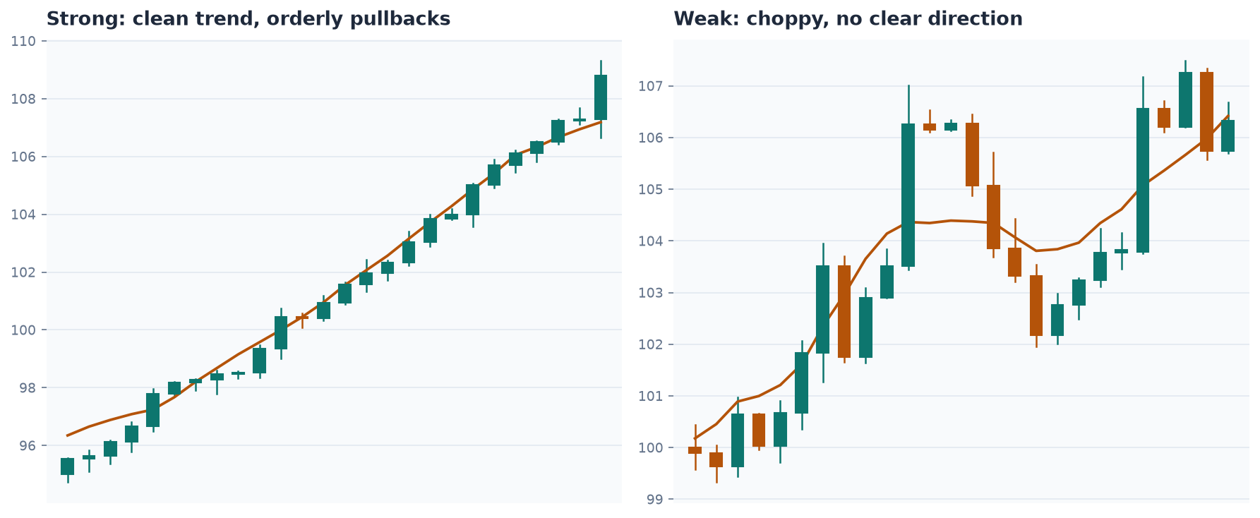
Characteristics of a Strong Daily Chart
A handful of traits tend to show up together on charts that go on to make outsized moves:
- Large gaps or windows ahead: wide-open price territory above the current price with no built-up resistance, giving the stock room to move without a fight.
- No nearby overhead resistance: the stock isn’t running straight into a prior high, a round number, or a well-tested trendline.
- Price above the long-term moving average (commonly the 200-period): or, if below it, enough room beneath it to allow a meaningful bounce before running into that resistance.
- A history of large moves: a stock that has made a significant run before (sometimes called a prior “momentum name”) tends to attract disproportionate trader attention when it starts moving again, because market participants remember it and are quicker to act.
Characteristics of a Weak Daily Chart
The inverse traits tend to cap a stock’s potential: price sitting right below several layers of resistance stacked close together, a long base with no history of meaningful moves, and price trapped below short- and long-term moving averages with little room before hitting the next ceiling. A stock can still spike on a weak daily chart — news can push price through resistance regardless of the chart — but the odds of that spike extending meaningfully are lower, and the odds of a fast reversal back down are higher, because there’s more supply of prior buyers eager to sell into any strength.
Reading For Bag Holders
One recurring judgment call: whether a stock’s recent price history has left a meaningful number of traders holding losing positions at higher prices — informally, “bag holders.” A stock approaching a level where a large number of buyers are sitting on losses tends to face real selling pressure at that level, as those traders look to exit at breakeven the moment they get the chance. This isn’t visible as a line on the chart the way support and resistance are, but it can usually be inferred by looking at how much volume traded at a given price level and how long ago that was.
A Synthesis, Not a New Tool
None of this introduces a new indicator or pattern — it’s a framework for combining everything already covered into a single read of a chart’s overall quality before deciding whether a setup is even worth pursuing on the shorter timeframes.